NEW WEBSITE
I HAVE A WEBSITE!!
well kind of…
It needs alot of improving and a big big big personality injection, but head on over there to see my work and to see the new “News” section, which is were my blog will be updated from now on, (when i say updated I mean updated about once a month due to the vast amount of work at the moment!)
Anywho head over at :
http://www.emilylouisereynolds.co.uk
Goodbye WordPress!!!
FMP – Boundaries
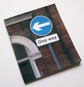
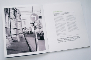
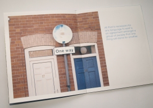
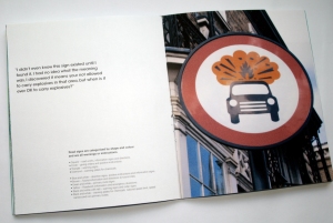
My FMP (final major project) this year was to look at boundaries. I decided to look at the way we use language without words to combat boundaries between people.
I looked at the way signs and symbols are all around us which we hardly notice and that we follow the instructions of without question.
ISTD – mp3
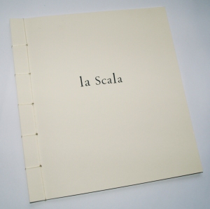
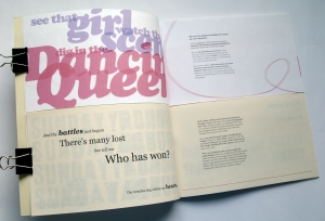
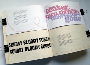
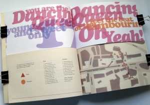
One of the 2009 ISTD (Internationally Society of Typographic Designers) briefs this year was to compare and contrast two songs typographically.
I decided to look at my parents favourite songs when they were younger, for my Dad it was U2’s Sunday Bloody Sunday and for my Mum Abba’s Dancing Queen.
I wanted to show the immense contrast between the two songs, so decided to place one book above the other so they can be read at the same time and the contrast between a cheery bright happy song could be seen against a dark song about the Bloody Sunday killings in Northern Ireland. It also gives the impression of the two opposites being as one together as a metaphor for my parents being together. (Soppy I know but it works!)
I used my parents ages when their favourite songs came out as the dimensions of the inside pages (13 and 22) and used the name “la scala’ as that was the name of the night club they met in and also means (music) scale in Italian. 🙂
TV Channel Identity
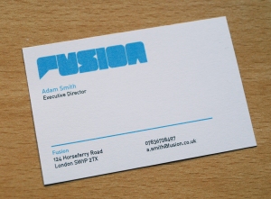
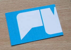
I had to create my own TV Channel and it’s identity (logo, business card, letterhead), and make 4 animations for the channel including a ident and a sting. I decided to do a new music channel where the viewer could interact with the show. I used a speech bubble in the logo to be used as a graphic device. Above is the business card with the logo.
Shelter Annual Report 06/07 Redesign
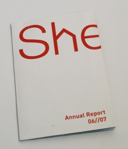
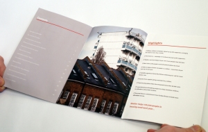
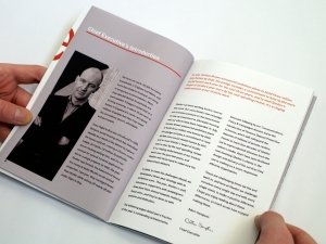
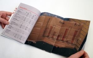
For this brief I had to redeisgn the homeless/housing charity Shelter’s 06/07 annual report. I used a lot of fold out pages to ‘shelter’ photographs or text within the report. I’m quite pleased with the outcome.
Jellybeans And Nanoquarks


Personally I hated this brief! I was given a strange journey about how these make beilve things called Nanoquarks went through a process to become Jellybeans. Basically I had to depict the journey any way I wanted. I decied to do a cooking magazine insert for Jamie Oliver’s new magaizne becuase ingredients when through a process, a chemical change and became something else, much like the Nanoquarks journey to becoming a Jellybean. I re-createdthe belly band and put a third section to the magazine on how Jamie would teach you to make Jellybeans from the finest Nanoquarks around! It does the job.
Derive – The Zoo!

For another part of the Derive brief, as a group we had to travel to somewhere we don’t usually go and map our journey. We decided to make it a fun day trip and decided to go to Twycross Zoo! And what a wicked day it was! Thanks to Jo for the lovely photo used in my post 🙂
Derive – Mapping

Here I had to create a nice graphical mapping of where I went in Lincoln during 5 days.
YCN Christmas Cards


One of the YCN briefs this year (08/09) was to make alternate Christmas cards for the Institute Of Contemporary Arts.
I produced 9 cards in 2 sets.
Set 1:
The first card uses the ICA spots logo to alternatively depict Santa’s 9 reindeer, including Rudolph, which was hand embossed.
The second is an alternate depiction of ‘Twinkle Twinkle Little Star which was hand rendered and hand embossed.
The third was a Christmas tree pictured within a 5×5 Rubix (a classic Christmas gift) which had no photo-shopping and no pealing off stickers id like to point out! (Thanks Scott!)
Set 2:
My second set were all hand stictched on blue card using different typefaces astrick’s as snowflakes.
Community


For this brief I had to look in to and document a community I would not normally be a part of.
I decided to become a part of the coffee drinkers community and find out why coffee shops are become so popular and becoming such a community in itself.
The end result was this book I created with photographs and quotes from regulars within the coffee shop community.
You must be logged in to post a comment.